Eastland Insurance is one of the most established insurers in Bangladesh. Its website, though, looked like something from the 1990s. My brief was to make it modern and easy to use, keep the brand people already trust, and add something the old site couldn’t do: a calculator that lets customers work out their own premium.
The problem
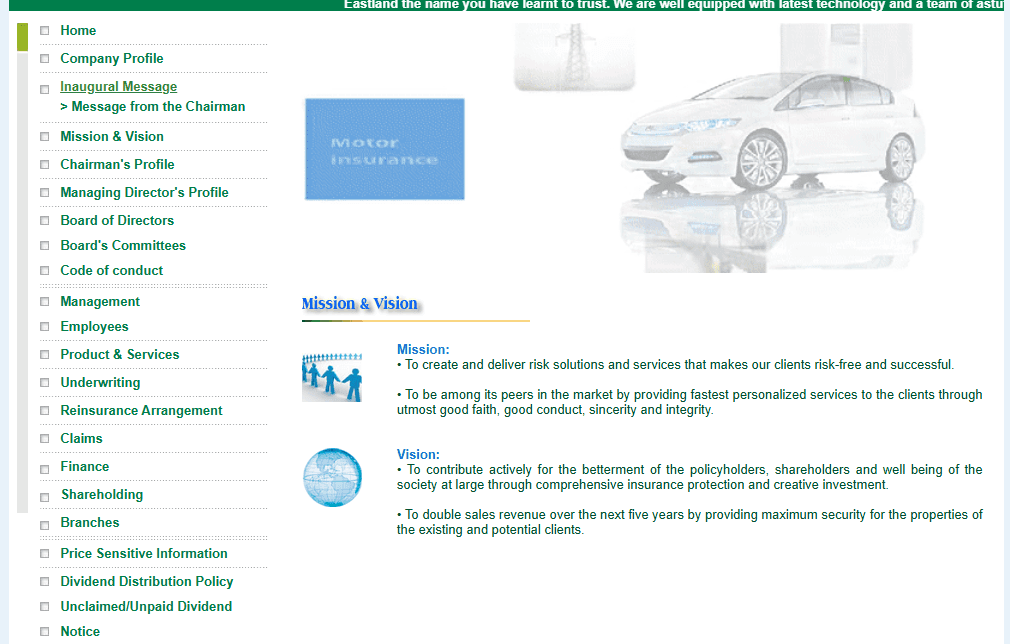
The old site was a set of static pages. You could read about the company, but you couldn’t really do anything. If you wanted to know what a policy would cost, you had to call, visit an office or fill in paperwork.
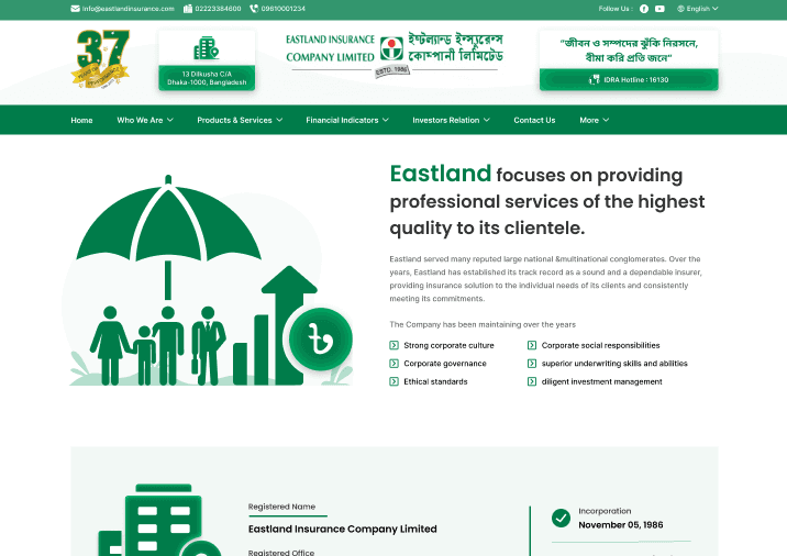
Before
Static pages. To get a price, you had to phone or visit.
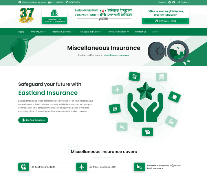
After
A clear structure, with the calculator built in.
That worked for long-standing customers, but it was a wall for younger people who expect to sort things out online. So the question became: how do we make the site feel modern and useful, and turn a complicated pricing process into something anyone can use on their own?

The challenge
The calculator was the hardest part by far. Before I could design it, I had to understand motor, boiler, fire and other kinds of insurance properly. There was no budget for user research, so I went through the company’s paper policy documents one by one, working out how each category was priced and how those rules could become calculator logic.
On top of that, the client had three firm requirements.
- Fixed by the client
Keep the green brand
Eastland’s green identity is well known in Bangladesh, so it had to stay.
- Fixed by the client
Keep every word
All the existing text had to remain. My job was to reorganise it, not rewrite it.
- Fixed by the client
Use real data
The mockups would be shown to executives, so they needed real names, figures and examples.
The last one meant the designs couldn’t feel like a concept. They had to look and behave like a site that was already live.
Research
My research came from three places: the paper-based policies and workflows, the pricing formulas behind each insurance type, and insurance websites from around the world.
Calculator logic
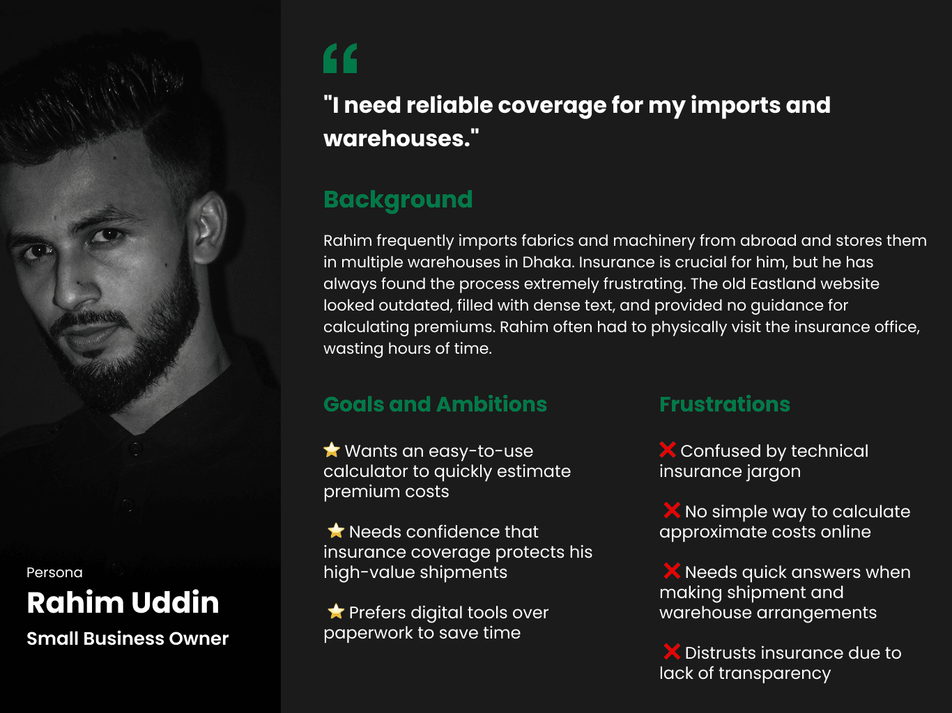
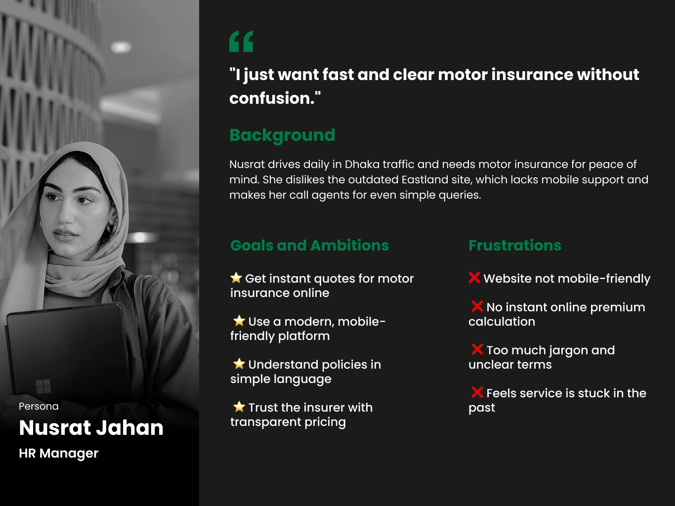
Research notes and formula mapping.
The approach
With the brand colour and every word of the content fixed, the real work was structure. I wasn’t just putting a new coat of paint on the site. I had to take outdated content and arrange it in a way that makes sense to people browsing today.

Design
Reorganising the content
I started by mapping everything on the old site and regrouping it, so services, policies and company information were each easy to find without overwhelming anyone.

Designing the calculator
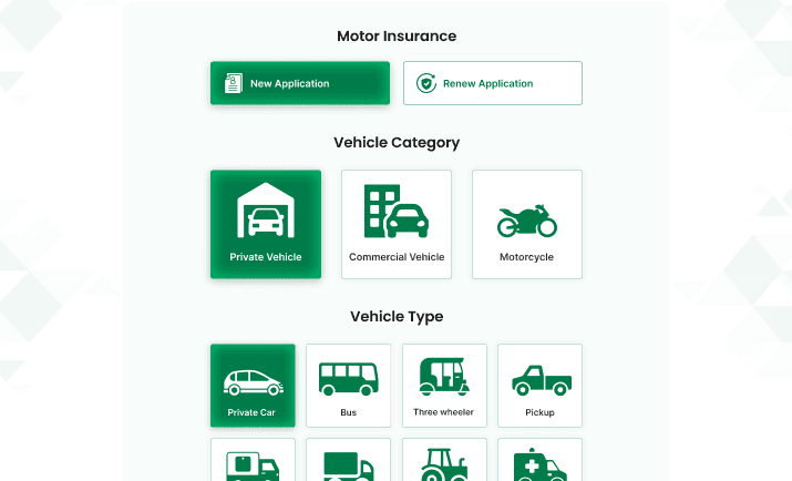
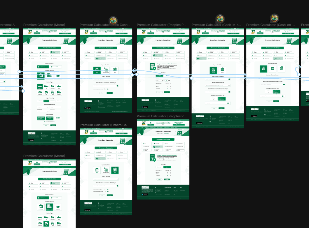
Next came the calculator. I built the insurance formulas into the interface and broke them into small, guided steps, so someone with no insurance knowledge could get an estimate without feeling lost. Try it below. The inputs are examples.
Making it feel real
Finally, I built an interactive prototype and filled it with real insurance data, real names, real figures and real case examples, so the executives could judge it as if it were already live.
Feedback and approval
- 1
Share the prototype
The client and the internal team clicked through the interactive version.
- 2
Collect feedback
We checked that the calculations were right, the navigation was clear and the brand still felt like Eastland.
- 3
Refine
I worked through the feedback in several rounds until everything held up.
- ✓
Approved for the executive presentation
The result
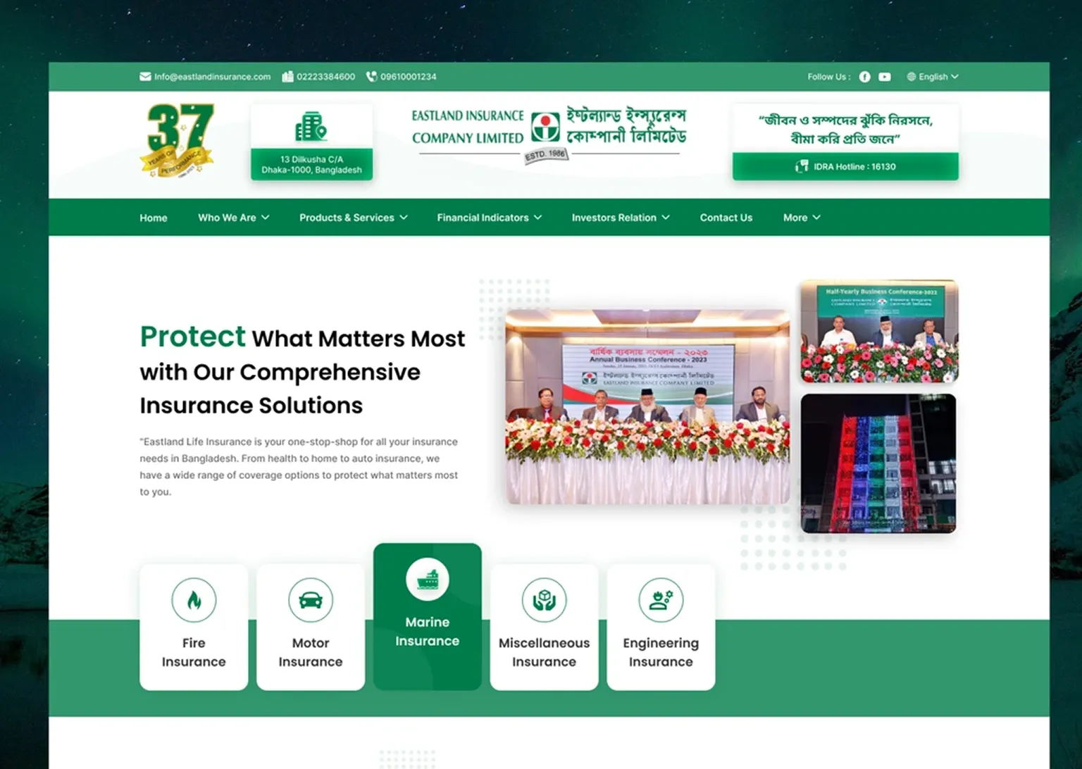
The finished site keeps Eastland’s identity but feels completely current. Customers can estimate motor, boiler and fire premiums themselves, right on the website, and everything sits in a clean, responsive layout that works on any screen.
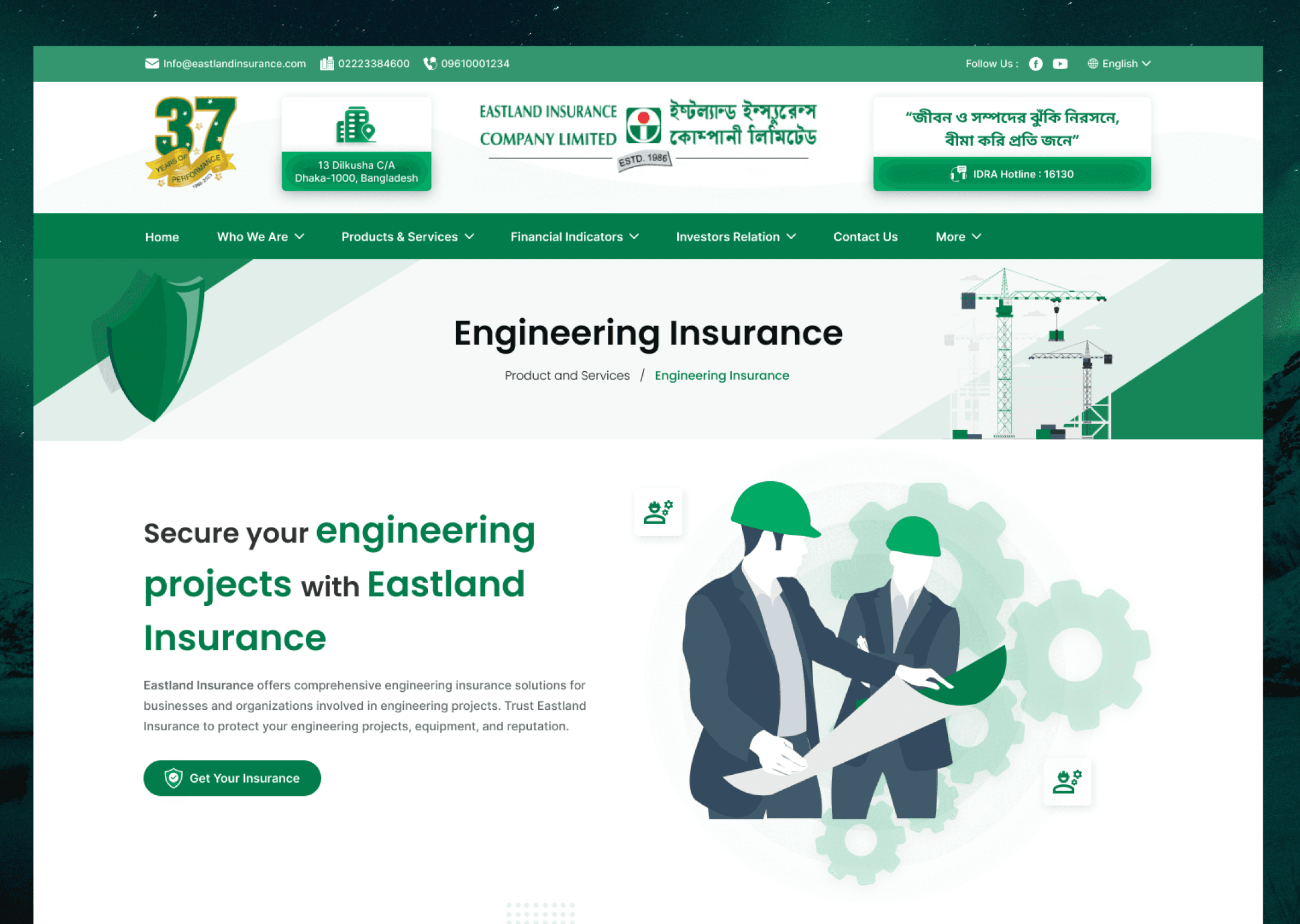
From“old and outdated”to“modern and professional”
The client called the calculator a game changer. It makes insurance easier to understand and cuts down on paperwork. The executives especially valued seeing real data in the prototypes, which made the whole idea far more convincing. The calculator has since become something that sets Eastland apart in the Bangladeshi market.
What I learned
Understanding the domain can stand in for interviews
I never spoke to a customer directly, but learning the insurance rules in depth let me design a tool that reflects how pricing really works.
Tight constraints still leave room
Fixed colours, fixed text and real data could have felt limiting. Instead they pushed me to focus on structure, which is where the real improvement was.
Realism wins the room
For a high-stakes presentation, how real the work feels matters as much as how well it works.
Looking back
This project was more than a facelift. It showed how a traditional insurer can adopt modern digital habits without losing what makes it trusted. The website went from a place you read about insurance to a place where you can make your own decisions about it.
The biggest lesson for me was taking a complicated, paper-heavy system and turning it into something simple that also creates real value for the business.